Tips of the Trade: 5 Design Rules You Should Always Break with Jeremiah Brent

Interior designer Jeremiah Brent constantly finds inspiration for his residential and commercial projects from nature — they manifest in colors, textures, an olive branch or a precious stone incorporated into his designs. Lately he’s also been drawing inspiration from a place closer to home. “I love seeing the world through my daughter’s eyes; how she finds life, love and curiosity in everything she touches,” he says of two-year-old Poppy; the impetus for Brent and husband, designer Nate Berkus, to move from New York to Los Angeles. “We wanted her to have space to roam,” he says. While Brent notes that since becoming parents, the design pair, who star on Nate and Jeremiah By Design have remained consistent in their style, he does admit they give more weight to the practicality. “For example, we recently became fans of using outdoor fabric inside, because of how durable and kid proof it is,” he explains. Always returning to the idea that spaces should reflect the personalities that inhabit them (“Everyone wants their space to look like a Pinterest board and there’s nothing wrong with that – but remember to bring a part of who you are into your décor"), Brent’s been known to skirt more than a few time-honored rules when designing. Here are a few he thinks are worth breaking.
1. You Must Hang Your Artwork.
I beg to differ! Most traditionalists will say you should hang all of your art at eye level, but I like letting my art tell a story, and having pieces flow throughout the room – or even lean against a wall.


2. Small Spaces Mean Small Furniture.
Just because you have a small space doesn’t mean you have to restrict the scale of your items! A statement piece — a rust orange velvet couch, for example — can act as the focal point and main art piece of a room; elevating the space and bringing the elements together.
3. Never Mix Metals.
Juxtaposing silvers, golds, brass, and other metallics adds an edge to a space and keeps things interesting. Don’t be afraid to mix it up!


4. Matchy is a Must.
Not so! From decorative pillows, to dining room chairs, I encourage everyone to play around with textures, patterns and colors. That blend can still be chic with the right balance: a good rule of thumb is to ask yourself what story you’re trying to tell with each item, and find flow in the chaos. I find it helpful to think of it as “accenting” over “mixing;” stick with a monochromatic color scheme or pick a modern coffee table in a traditional room.
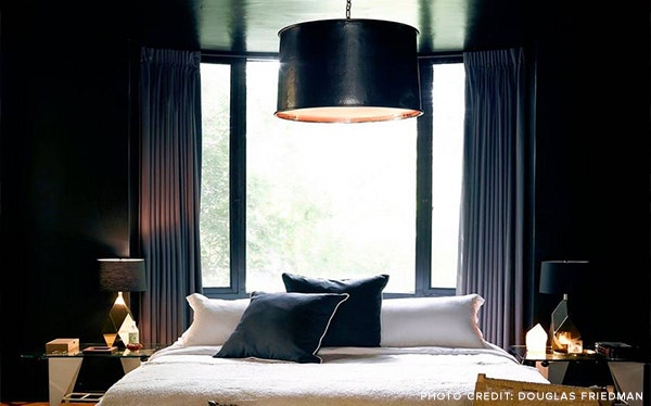
5. Ceilings Must Be White.
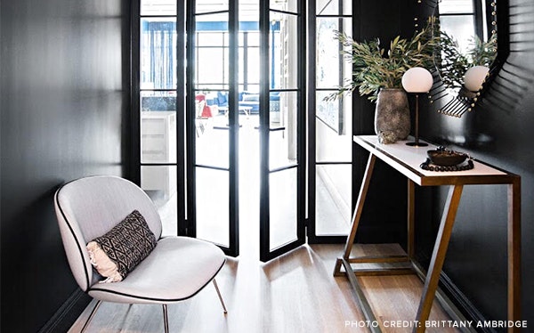
Use this as a moment to be creative with color! Contrary to popular belief, black can be a great color for expanding a room and giving an illusion of infinate space. If there are beams, consider leaving them bare to show some structure.


